A History of Candy
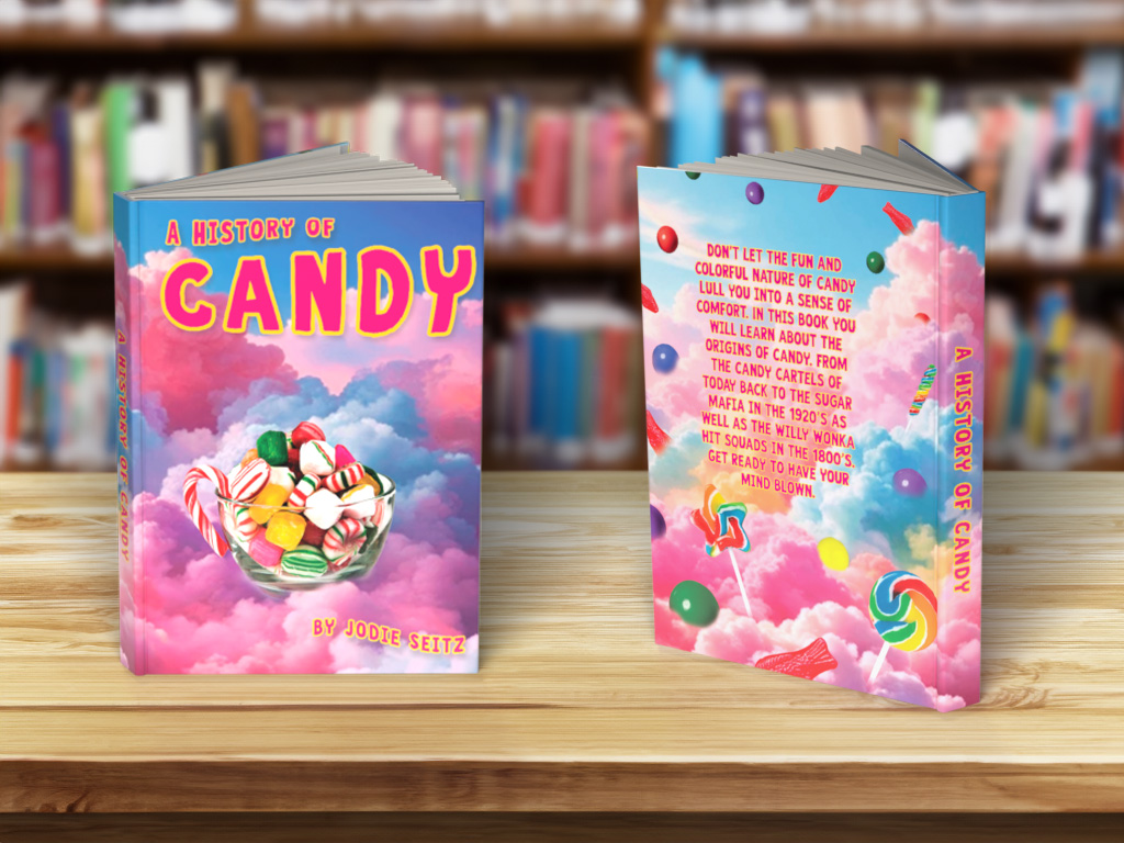
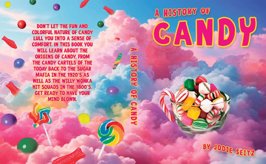




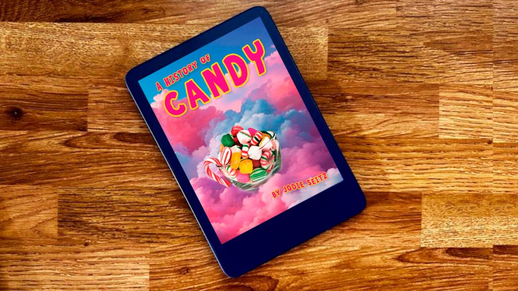
I’m especially proud of how this project turned out. It was created as part of an advanced Photoshop course, where I challenged myself to experiment with composition, image manipulation, and visual storytelling.
The background is a composite of several images, intentionally designed to feel playful, colorful, and slightly surreal. I paired it with a whimsical typeface to create a striking contrast with the more serious and unsettling themes explored within the book. This contrast was an intentional choice, creating an intriguing tension between the cheerful visual aesthetic and the more complex subject matter.
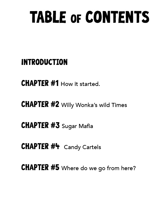
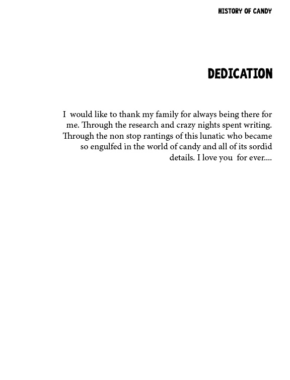
The project includes mockups of the front and back covers, along with a sampling of the book’s interior pages. I also created a tablet mockup to demonstrate how the design could translate into a digital reading experience while maintaining the same visual impact.